Finishing my blog in 3 days with AI
Made the repo in 2023, then went dark. In the summer of 2026, I revived it: 3 days, 69 commits.
On this page
Open the git log and you can see this blog's whole history at a glance. January 10, 2023: full of motivation, I created the repo and pushed the setup commits. I left forty-odd commits scattered through June, then went dark. Look inside those forty commits and most of them are setup, too. Picking lint rules, arranging folders, agonizing over component names. I never wrote a single post.
For three years, nothing happened.

Then I opened it again on July 20, 2026, and finished on the 22nd. Sixty-nine commits piled up in three days, forty-six of them on day two alone. For something I'd put off for three years, it ended so fast it felt anticlimactic, and I wondered what I'd been so afraid of.
What happened in three days
Grouped by date, each of the three days had a different personality.
Day one was a construction site. Switched the package manager to bun, set up design tokens and the dark theme, ripped out i18next for a hand-rolled i18n with Japanese added. Blog list, post, and tag pages, serverless comments on Supabase, the SEO foundation of OG images, sitemap and RSS, a 404 page. By evening the skeleton was standing.
Day two was a 46-commit binge. ⌘K search, a dark mode redesign, sentence-level highlight sharing, reading settings, mobile swipe, random comment nicknames, the Konami code. Almost everything this post shows off came out of that day. Wedged in between were a Next.js 16 upgrade and a move to Biome, which alone would have eaten a weekend in the old days.
Day three was the deadline. Redrew the favicon as the two-eyes design, registered with Search Console and Naver, redesigned the OG card. And wrote this post.
Of course, that pace wasn't mine alone.
Why three days was enough
What changed isn't me, it's the tools. This time I built the whole thing with AI, start to finish.
Last year, in Is MVP still valid, I wrote that AI has raised the bar for "minimum." I didn't expect this blog to become that post's evidence. Page transitions, swipe gestures, sentence-level sharing, a comment system. Features that each would have sat on a "someday" list are all inside a three-day personal blog. The "minimum" for a personal blog went up too.
How I build changed as well. The old me would have burned half a day choosing a toast library; this time, instead of choosing, I built.
Not bravado, just economics. Pairing with AI, most interactions come out under 200 lines. Reading a library's docs and wrestling its config now takes about as long as building the behavior from scratch. At that point you pick the one that fits your hand. The toasts, the gestures, and the comments on this blog are all code built that way. As a bonus, it's all code whose behavior I can actually explain.
Things you can try right now, on this page
I picked just three of the things built in those three days. All three work on the very page you're reading. On mobile, pull the screen sideways; on desktop, press ⌘K.
1. Flipping between posts on mobile
On mobile, finishing a post means going back to the list to find the next one. I hated that round trip, so I made it flip sideways like turning a page.
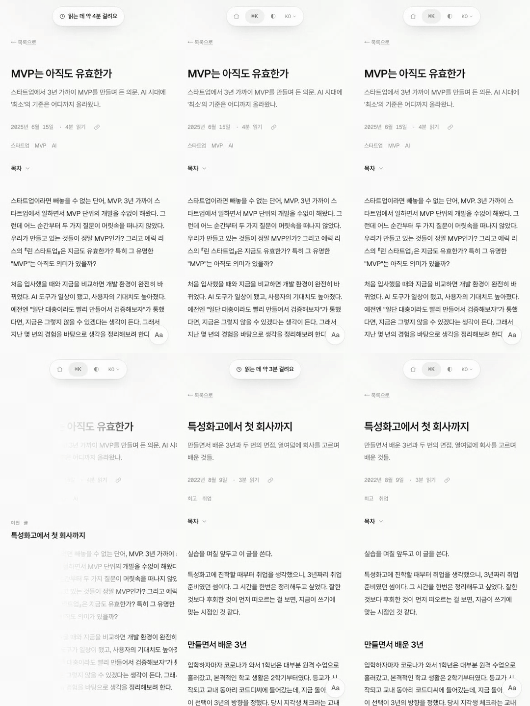
No gesture library, just three touch events, and the real work was deciding the rules, not writing the code.
- It counts as a swipe only when horizontal movement exceeds 10px and is 1.2× the vertical
- Move more than 12px vertically before qualifying and the touch is treated as a scroll and ignored for good
- Touches starting on things with their own horizontal scroll, like code blocks and tables, are ignored
- Once a swipe qualifies, scrolling is locked with
preventDefault()
The "feel" of the pull comes from a single function.
const THRESHOLD = 88;
const damp = (p: number) =>
  0.32 * Math.min(p, THRESHOLD) + 0.14 * Math.max(0, p - THRESHOLD);
If the page moves as far as your finger does, it feels cheap. Compressing to 0.32× up to the threshold and 0.14× past it is what creates the rubber-band resistance. AI can't pick these coefficients. They're values I tuned by pulling on an actual phone. On release, the view transition's slide takes over, and the page moves out in the direction you were pulling. Reachable posts are prefetched, so there's no wait when you let go.
Something funny happened while recording. A feature I clearly built did nothing when I pulled left, and I assumed it was a bug. Turns out it was the newest post, so there was no next post, and I'd written it to refuse the gesture when there's nowhere to go.
2. A capsule instead of toasts
This site has no notification toasts. Copying a link, switching themes: every notification comes from the navigation capsule at the top, stretching to show the message. The "about 4 minutes to read" you see when opening a post is the same capsule.
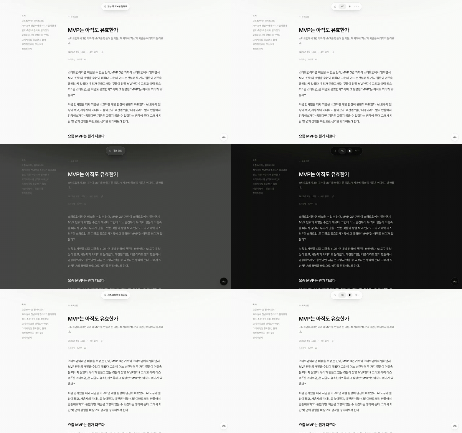
CSS can't animate to width: auto.
So it's built FLIP-style: pin the current width in pixels, set the target width on the next frame.
State management is a single hand-rolled store, 70 lines.
Any component can make the capsule speak with one islandStore.notify() call.
Once it worked, I spent more time on the small rules than the feature. Scroll down and it hides, scroll up and it returns, with movements under 6px ignored so it doesn't jitter. While it's talking, that is, while a message is up, scrolling doesn't hide it.
A half-day bug came out of here too.
One day the capsule's blur just vanished, and the capsule's code looked fine no matter how long I stared.
The culprit: one overflow line I'd added to a parent wrapper while tidying the layout.
That's the day I learned backdrop-filter dies silently when an ancestor gets clipping.
The bug is always in the file you're not looking at.
3. The domain's secret
⌘K opens the search palette, which is secretly also a terminal.
help, theme dark, and whoami all work, and the key one is qwerty.
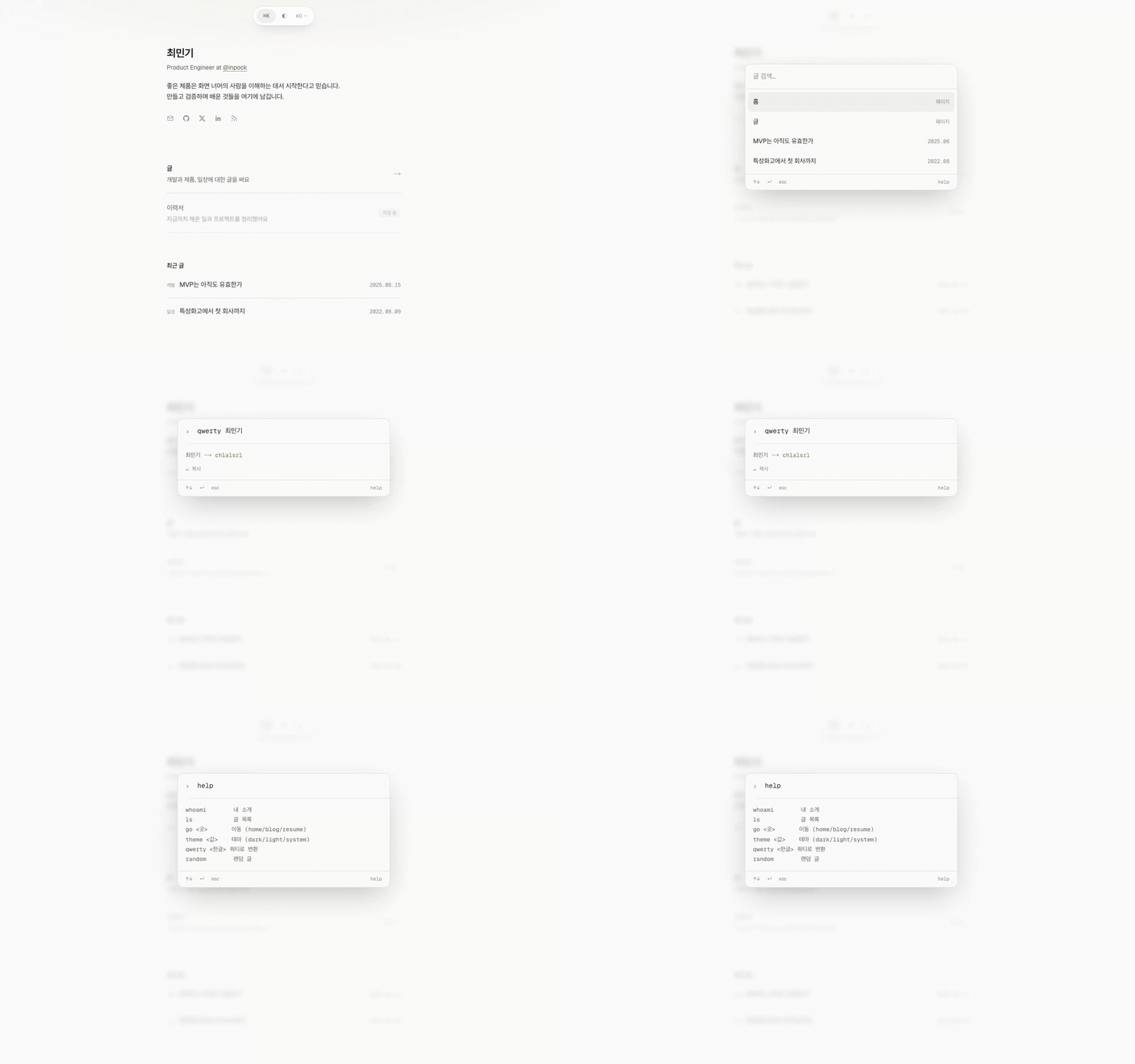
Type qwerty 최민기 and you get chlalsrl.
Korean keyboards share the QWERTY layout, so typing my name "최민기" without switching input modes produces, letter for letter, chlalsrl.
The answer to why this domain is chlalsrl.com is hidden inside the palette.
The downside is that saying the domain out loud always needs the full story; the upside is that anyone who hears it remembers it instantly.
Enter the Konami code with the arrow keys and the capsule greets you; the console carries the deployed commit hash.
It's fine if nobody ever finds these, but if someone someday types sudo into ⌘K and laughs, that's worth the build.
One more: sentence sharing
I said three, but I can't walk past this one. Select a sentence in a post and a share button appears; press it and you get a link that jumps straight to that sentence.
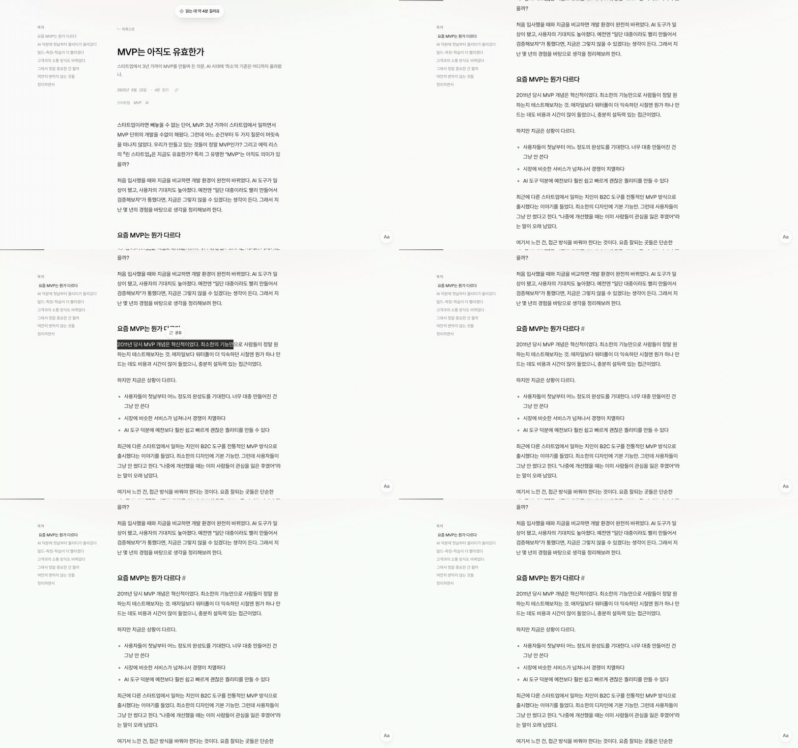
Better than someone sharing a whole post link is someone sending you the one sentence they highlighted. It means that sentence stayed with them.
The fun part is that the server does nothing here.
The link uses the browser-standard Text Fragment syntax (#:~:text=), so the opening browser scrolls to the sentence and highlights it on its own.
My code only detects the selection and builds the URL.
Shared sentences are tallied, and when several people overlap, they appear under the post as "sentences readers underlined."
I'm curious myself which ones will survive.
Working with AI
Of the three days, AI spent far more time writing code than I did. But looking back, did I do nothing? Not at all. The roles were just different.
AI is good at making things. Swipe touch handling, the capsule's FLIP, the Supabase wiring: describe them and they appear. It even handles insider tricks on its own, like planting an inline script before first paint to stop dark mode's white flash on refresh.
What it can't decide is "how much." The damping coefficient 0.32, the 6px scroll threshold that hides the capsule, the 70ms interval between nickname rolls. Every one of those numbers came from touching the screen and judging by hand. There's no way to land good values without feeling them, and that judgment can't be delegated.
Subtle bugs still get caught together. At one point every Korean tag page 404'd, because tags were pre-encoded at build time. The framework encoded them once more, and the pages were prerendered at double-encoded paths. It's the kind of bug whose symptom hides its cause, and narrowing that down still takes a human.
Things built and then deleted
The biggest surprise of this project was how many removal decisions I ended up making. The receipts are all in the commit log.
- Built a guestbook page, deleted it hours later
- Swapped likes for a multi-emoji reaction bar, reverted one commit later
- Added a projects section and update history to the home page, removed them that same night
- The swipe preview started loud, with arrow chips and label cards; two rewrites later only the overlay and title remain
- The comment input card accumulated four style commits on its own
- The OG card reached its sixth version, then rolled back to the third
The highlight is the OG card. I put the two-eyes mascot on the share card and removed it, per the commit log, three minutes later. Added at 00:51, removed at 00:54. Inside 1200×630 the title has to be the protagonist, and the eyes kept stealing the gaze.
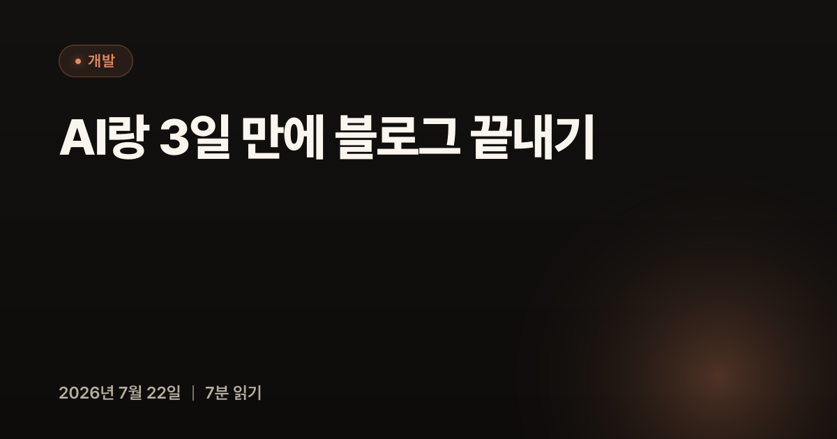
Because building got cheap, building first and judging after became possible, and choosing what stays and what goes became the real job. AI wrote the code; I decided what to delete. If you ask which of those is product work, I'd say the deleting.
Everything else that went in
Even after all this, there's more left over.
The comment form never opens with an empty name field. A random nickname is filled in from the start, and pressing the button next to it rolls new ones like a slot machine. Avatars are drawn from a hash of the name, so the same name always gets the same face. My hypothesis is that an empty name field makes people deliberate and close the tab; whether that's right, I'll only know once comments pile up.
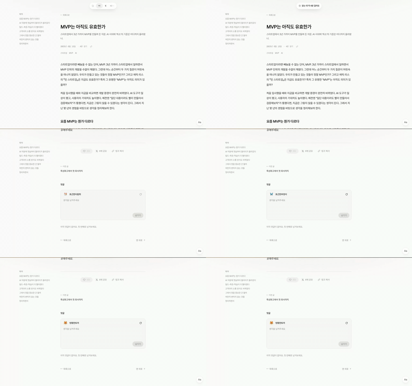
The reading side got attention too. Turn on focus mode and only the paragraphs near the center of the screen stay bright; its first user is me, whose eyes wander to other lines in long articles. Dragging text in dark mode flashed white with the default inverted selection, so I pressed it down with a surface that mixes in a hint of the accent color.
The two eyes in the favicon are drawn in code, with no image files. The original SVG's proportions live as constants, so everything from the 64px favicon to the 512px home screen icon comes from the same code. The site supports Korean, English, and Japanese, and posts without a translation fall back to the original. This post has all three.
Three days is enough
Thinking now about why I put it off for three years, the estimate in my head had stopped in 2023. I'd filed the blog rebuild as a months-long job, so I couldn't face it, and because I couldn't face it, I never even opened it. The tools had changed and I was still holding the old estimate. When I finally opened it, it was three days.
Everything is built, so now it's time to write.